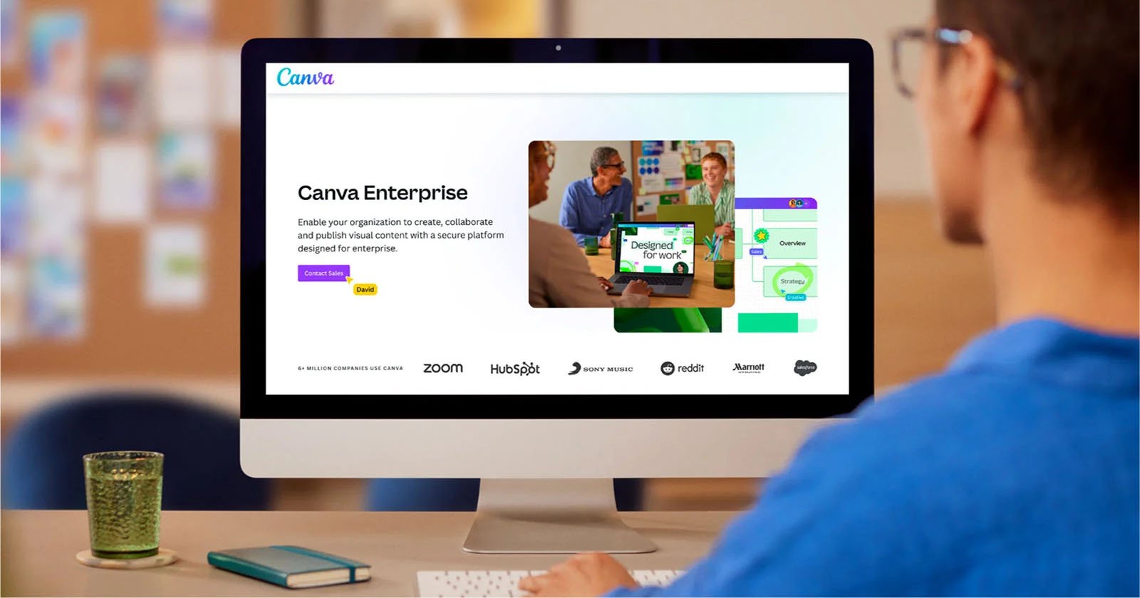
The popular online editing application Canva received a significant makeover today at the Canva Create Event in Los Angeles. The changes affect nearly every aspect of Canva, from its pricing structure, tools, templates, and editing experience. Apps from Amazon, Google, and Meta also provide asset libraries and feedback on ad designs. While the brand may have started as a way for everyday consumers without a design background to make high-quality creations for social media or professional environments, it’s clear that use of the app has grown exponentially, which has had a significant impact on Canva’s competition. An Enterprising Subscription Tier To that end, Canva has launched a new Enterprise subscription. While the app already has its Teams subscription level, the new tier will cater to large corporations, including ones with multiple internal teams. Meanwhile, Teams will remain serving small- to medium-sized businesses. Canva says its products are already used “across 95 percent of Fortune 500 companies,” and noted that its additions reflect “a major step forward for the company’s enterprise strategy.” “We are excited to introduce a revamped Canva experience and a suite of new products to empower every organization to design,” says Melanie Perkins, Canva co-founder and CEO. “As demand for visual content soars, navigating organizational complexity is more challenging than ever. We democratized the design ecosystem in our first decade and now look forward to unifying the fragmented ecosystems of design, AI, and workflow tools for every organization in our second decade.”
Enterprise subscribers will get scalable cloud storage, a consolidated account for all their tools, “enterprise-level” security, and advanced brand controls. That security even includes indemnification for AI-generated content “for eligible customers,” something competitor Adobe also offered customers. Canva also seems eager to emphasize the ability to keep all users under one hub while providing the ability to grow. An Office Makeover Beyond the new subscription, Canva unveiled a new workplace user interface. It has a redesigned editing toolbar that “creates more space and improves focus.” For example, popular features, like automatically removing the background, are prominently displayed. Similarly, a new customizable homepage will allow users to favorite specific designs, folders, and templates. Organizations can also pin company- or team-wise content. For other items, the search feature gets some advanced filters to make finding the right item much faster. Plus, Canva improved collaboration by making it easier to move between projects, access essential resources and assets, and apply designated brand guidelines, bolstering Enterprise subscriptions’ usability. The new homepage and editing experience are available today, but only to the first one million users to discover the secret portal hidden on the homepage. For everyone else, availability rolls out in August. A Canva For Everyone It’s also easy to think about the design team of a workplace being the only ones who might need a Canva subscription, but the app’s growth signals that just about everyone is interested. Today, Canva announced new tools tailored to different parts of an organization via Work Kits. These are work-specific templates explicitly made for various use cases. For example, the human resources department now gets resources for onboarding decks, company newsletters, and job advertisements. Sales gets its own pitch decks, sales reports, and sales proposal templates. The creative team can use production request forms and brand strategy templates.
Some of these tools already exist within Canva in some form, but the company will give them a bit more polish and cater more toward how businesses might use them. It feels similar to the social media templates the app has long offered but with less of an influencer focus. The company introduced Canva Courses to help users who are less familiar with the editing and design tools best utilize the technology. To keep things from getting too messy as more hands work on things, Canva lets users track changes and collaborate on edits. Enterprise Worthy AI In time for its workplace upgrade, Canva announced an upgrade to Magic Studio, its suite of AI tools. Users can already turn text prompts into graphics or image edits, resize or convert designs to different formats, and have it write text. Now, Canva says Magic Design, which automatically creates entire designs from prompts, is three times higher quality. AI-based photo editing is also meant to work more smoothly, allowing users to easily move, remove, and edit objects in images. Plus, the Highlights feature can automatically cut a selection of clips for longer videos, and Enhance Voice makes the sound in footage far clearer.
The company also brought in third-party assistance from Salesforce, among others, to auto-fill designs with text and images to help move the workflow along. Similarly, the Bulk Create feature lets users upload CSV or Excel files and quickly update images, text, and graphics “across various designs.” An Affinity for Affinity Some have also been waiting for updates thanks to Canva’s acquisition of design-focused platform Affinity. Today, the company revealed some updates thanks to the business move, including variable font support, a stroke width tool that edits pressure profiles of curves, and support for Arm 64chips, making the app optimized for the latest Windows PCs, just in time for the launch of Windows’ new Surface laptops. Overall, Canva’s showcase proved that the app is here to stay and is not afraid to compete with long-standing editing tools. Image credits: Canva


