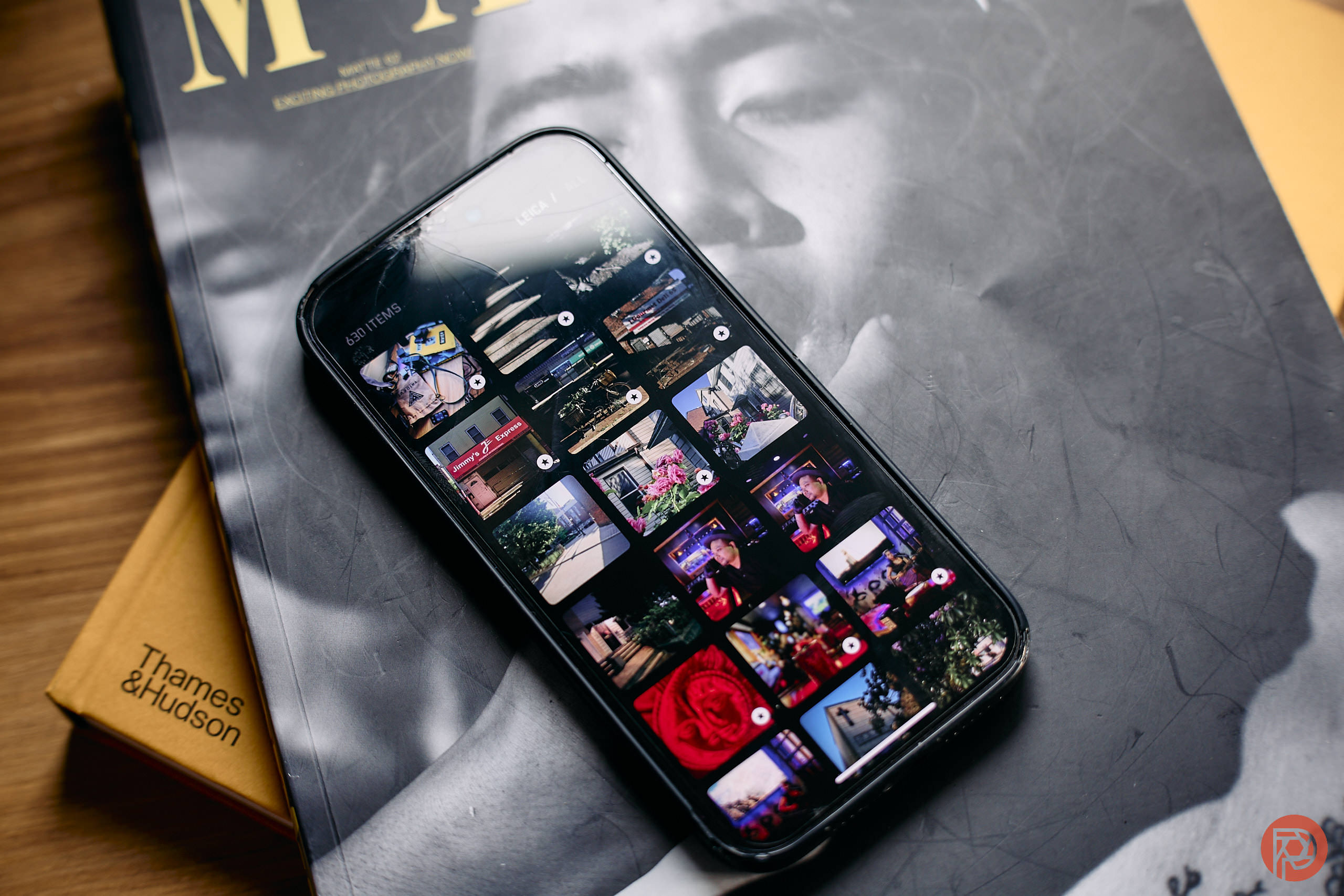
The new Leica LUX app for your phone is pretty dope — it’s embracing the future as much as it is trying to keep the past and present alive. Unlike what so many other companies are doing with their phone apps, Leica LUX isn’t going to replace Leica Fotos. Instead, it’s a dedicated camera app that brings the same Leica looks to your phone. Previously, you needed special M series cameras, the Q3 or the SL3 to do this. However, it also gives me a burning question: Why can’t I get these looks with my $5000 Leica camera that I paid for only a few years ago?
For this review, we tested a pre-release version of Leica LUX. The core functionality was there, but it did have a few bugs.
When you open up Leica LUX, you’ll see a camera app. You can control various things such as the flash, having a grid, exposure compensation, etc. And you’ll also see two special modes. One is program auto, and it allows you to have a bit more control. This mode also uses the various cameras on your phone at their specific focal lengths — plus it labels them accordingly. In the aperture priority mode, Leica LUX renders images that appear similar to results from Leica’s own stable of M-mount lenses. It also gives you aperture control — but it’s actually just done via software instead of needing to also set the ISO and such. In aperture priority, you cannot do exposure compensation; or at least our Leica reps and I couldn’t find that option.
Both of these settings also let you use Leica Looks, which are similar to Fujifilm’s film simulations.
How closely do they compare? Well, we’re a great website to offer that as we’ve tested nearly every single Leica M-mount lens in the company’s stable for the past nearly two decades.
Leica 28mm Compared
The top image was done with the new Leica LUX app while the bottom was shot with the 28mm f1.4 instead. The bottom surely looks a lot more like it was shot with a real-camera instead.
Indeed, you can surely tell when an image is still made by a phone or not as phone cameras deliver very overly processed images. Truly, phone cameras are the American White Sugar of the camera world.
Leica 35mm Compared
The Leica LUX app also has the 35mm f1.4 so how do they compare?
One image was obviously shot with the 35mm f1.4 while the other was made with a phone using the new Leica Looks. Anyone who has done watch photography knows that the first photo is pretty impossible to do with a 35mm f1.4 M-mount because of the close focusing distance.
Leica 50mm f1.4 Compared
What about these two? Which was shot with the Leica 50mm f1.4? It’s a bit harder to tell here. But the bottom image was shot for our 50mm f1.4 lens review, while the top photo was shot recently with the Leica LUX app.
Leica 75mm Noct Compared
In our Leica 75mm f1.25 Noctilux review, we shot the image on the bottom. The one on top was shot with our iPhone and the Leica LUX app.
So truly, I don’t think that Leica LUX will replace a dedicated camera and lens. But it’s a cool way to get Leica looks on your phone if anything.
At the same time, I really am wondering why these can’t come to my SL2s.


